Showing posts with label Review. Show all posts

Saturday, September 27, 2008

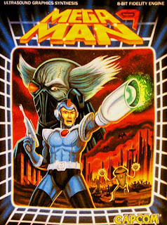
Mega Man 9 Review & Repair

Mega Man 9 is my favorite Mega Man game along with Mega Man X. This is probably due to the fact that I've recently beat these two Mega Man games since developing my critical-eye. Regardless, there's a lot to be said for Mega Man 9, a game which just barely qualifies for the retro-evolved genre. The game looks old school and plays just like Mega Man did when I was a kid gathered around TV with all the neighborhood kids trying to come up with a strategy to defeat Gemini Man. Because MM9 is practically an NES, so much of the experience should already be quite familiar to us. For this reason, I only want to touch on a few points in bullet point essay style.


ADJUSTABLE DIFFICULTY

Many claim that Mega Man 9 is a very difficult game. I do not think it is for many reasons. Starting with a base made up of the default weapon, the M Buster, and a few lives, the difficulty in beating the game can be adjusted to a very fine degree. Players always have the option of...

  1. collecting lives before going into more difficult stages
  2. collecting energy tanks to refill one's health instantly
  3. using powers to more easily overcome enemies and tricky platforming sections
  4. using the powers that each boss is weak to
  5. spending bolts to buy additional lives, energy tanks, M tanks, and other power ups including Beat, Spike Shoes, and the 1/2 damage power up.
  6. farming enemy respawn points to refill health and weapon energy
Also, the more you play, die, and continue, the more bolts you'll accumulate. With more bolts, the player has more buying power to adjust the difficulty of their experience.


LEVEL DESIGN

The levels in Mega Man 9 are masterfully crafted. They have the perfect balance of difficulty, enemies, length, original elements, simplicity, and organic unity.


Click to Enlarge
  • Each level is very linear and constructed like a sentence with a beginning, middle (mini boss), and end (boss). Each level/sentence represents a simple game idea. Look at Splash Woman's stage for example. The simple game idea is going down into the depths and come back out the other side. The traveling path makes a "u" shape.
  • To keep things moving forward there are few scrolling sections to each level. Also, the player is prevented from backtracking horizontally. Once you enter a section, there's nothing else to do but keep pressing forward
  • Enemies are generally fixed in specific locations within a level and have strict spawn design. Move just slightly off the screen, and a enemy you just destroyed will be waiting to take you on again. Many enemies function as a path blocker instead of chasing the player down. Having to shoot down such obstacles keeps the game focused on shooting instead of running/dodging. This design decision keeps the experience controlled, and uniform across play sessions.
  • The organic level design and organic art direction harmonize perfectly in MM9. In Splash Woman's stage (see above) everything is designed and arranged to communicate a functioning water treatment plant. The water in the beginning starts to flow downward, and water mines and octopus robots provide primary security protection (1-3). As the water descends, the spikes filter out unwanted content (5-8). The water the runs through pipe filters that generate air bubbles as waste. This air is expelled through holes in the pipe work (9-12). Next players hit a pocket of air in a pressurized zone where pipe runners run maintenance and security (12-16). Traveling up you encounter a computerized system mixing and filtering sections of water via sliding disks (14-16). And then you're practically at the boss, Splash Woman, who will battle in nothing less than the purest, most highly filtered water technology can provide. Sure it's a little imaginative, but the forms are all there.
  • By following through with this organic theme, the placements of the platforms and other level elements were guided. Like in Super Mario Brothers, bricks aren't placed willy nilly just so that Mario has things to break and platforms to jump on. The bricks in Mario are arranged to reflect functional structures; towers, bridges, stalagmites, etc. By following such organic guidelines, MM9 levels are as efficient, clean, and functionally focused as can be.
  • Aside from unique enemies, like in Super Mario Bros. 3/Super Mario Galaxy, new level elements are added to the MM9 levels as needed to further develop and define the governing game ideas for each stage. In Splash Woman's stage, the platformable water bubbles (9-12) and the disappearing water sliding sections (14-16) are specific to this stage and add unique gameplay to the level.

POWERS THAT POWER UP

Fleshing out a quality game after starting with a limited core design is a skill that Capcom uses very well. By adding a balance of abstract mechanics, extra modes, and unique level/enemy elements, Capcom is able to develop rich game ideas instead of flopping in undynamic, static redundancy.

To understand how the core design of Mega Man 9 is limited, we need to first look at the core mechanics and compare them against Mario and even other versions of Mega Man.


Mega Man's Base Abilities

  • No RUN mechanic. Megaman moves at the same instant and constant speed whether he's on the ground or in the air. Because there is no accelerative motion forward, it's not jarring to the player that Mega Man doesn't skid to a stop. It's not unusual that Mega Man can instantly reverse his direction in mid air either. Where Mario uses the RUN mechanic to create momentum (physics wise and game design wise) and increase difficulty by reducing the reaction time window for the player, Mega Man marches on in a relatively simple fashion.
  • Mario must get a running start to achieve his maximum jump height and distance. Mega Man doesn't, which makes difficult jumps within a level less dependent on adequate running room. For this reason, Mega Man can create difficult platforming challenges in a very small space.
  • Mega Man can only shoot straight. To aim, he must JUMP and SHOOT. Because the JUMP mechanic is highly direct in degrees of vertical height, players have the ability to accurately SHOOT at just about anything within jumping range. Fortunately, pullets travel through walls. These properties create interesting aiming situations that mix anticipation, aiming through levels, and platforming in unique ways.
  • The core mechanics (MOVE, SHOOT, JUMP) aren't very dynamic. You can't jump on enemies. Enemies generally aren't stunned after being shot. Also, the momentum from leading one's shots is diminished somewhat when it relies on memorization or luck.
  • Unlike other 8-bit and 16-bit Mega Man iterations, MM9 Mega Man can't CHARGE, DASH, WALL KICK, SLIDE, or WALL SLIDE. The acceleration when SLIDING gives players the ability to dodge low flying attacks at the risk of falling off of platforms or running into enemies. As we know, the CHARGE mechanic does all kinds of wonders for gameplay. The WALL SLIDE/KICK mechanics give a lot of vertical definition to Mega Man's movement possibilities. Combining the DASH with the WALL KICK, gives players the ability to leap far off from walls. With these mechanics, enemies, bosses, and platforming sections have more versatility to mix things up. The DASH mechanic when combined with the JUMP mechanic, gives Mega Man the ability to quickly move about any environement. Like Mario's RUN mechanic, moving more quickly also comes with risks. Without these things, MM9 is clearly more limited in the enemy and platforming challenges it can put players through.
Ultimately, Mega Man must be able to defeat the vast majority of challenges with MOVE, JUMP, and SHOOT. After all, these mechanics make up the core/base of the game and are inexhaustible. When a game isn't very dynamic (mechanic dynamics, interplay, counterpoint), instead of emerging as a vehicle of expression, such games usually move in the opposite direction toward optimization. While this is true for MM9, the design of Mega Man's (mostly) optional acquired powers give the player a vehicle of expression while dynamically changing the paths and strategies available to the player. It is these powers that give MM9 design layers, dynamics, variation, and depth.

The Powers


Click to Enlarge

The limitations of Mega Man's moving and shooting abilities are apparent. But with every boss Mega Man defeats, he gains the use of one of their abilities. Each ability enhances some combination of Mega Man's moving, shooting, and defensive abilities filling up a unique design space. Starting at the top middle (12 o'clock) and going clockwise...
  • Plug Ball: Travels quickly along the ground, walls, and ceilings. In the air, this attack shoots straight down, which is unlike any other Mega Man attack.
  • Magma Bazooka: Shoots a triple spread attack. The fastest of two projectile attacks that can travel diagonally up or down. This attack can also be charged.
  • Hornet Chaser: Up to three can be fired at a time. They will slowly chase down any enemy on screen flying through walls to get to them. These hornets also have the ability to retrieve items from the field and bring them back to Mega Man.
  • Concrete Shot: A fast projectile that quickly arcs downward making it difficult to aim. This projectile also stops against walls, ceilings, and enemies. Once it hits something, it solidifies into a brick of concrete that players can use as a temporary platform.
  • Black Hole Bomb: A two stage attack that sends out a slow moving target and then activates forming a black hole that draws in enemy fire and enemies. Setting up this attack requires a little patience, knowledge of the level, and timing.
  • Laser Trident: This attack fires and travels very quickly in a straight line, and has the ability to cut through enemy defenses because nothing stops it. There are also special obstacles that can only be destroyed with the Laser Trident.
  • Jewel Satellite: Activating this power creates a shield of jewels that circle the player that reflect basic enemy attacks. These jewels can also completely eliminate weak enemies upon contact infinitely without any additional energy consumption. A collision with a stronger enemy will cancel the jewels. The ring of jewels can be launched as a projectile.
  • Tornado Blow: This handy attack sweeps all enemies and their attacks up and off the screen forever. The wind that sweeps away the enemies also floats Mega Man upward extending the height of his jump.
  • Rush Coil & Rush Jet (not depicted): These two abilities give Mega Man a super jump and the ability to fly a jet around for a limited time. Rush, the dog, can safely stand on spikes allowing players to access some areas safely. When Rush Jet collides with a platform or wall, he disappears leaving Mega Man behind to deal with situation.
On top of the platforming, offensive, and defensive changes these powers bring to Mega Man's basic abilities, they also have decay. Let's face it. The player is quite over powered with access to all of these abilities, but with every use the powers consume energy. Without energy for a specific power, Mega Man can't use it. Use powers haphazardly and excessively, and soon you won't have anything more than the basic abilities.

The decay goes a bit further. When players die and respawn, the energy/ammo they consumed on the previous life doesn't reset. In this way, dying and poor playing isn't completely remedied by having lots of lives. If you use all of a power trying to defeat a boss and fail to finish him/her off, then when you go back to fight that boss, you'll have to battle without that power. This is most apparent in the final assault on Dr. Willy's fortress. Players have to fight through 4 large levels and 11 bosses before getting a chance to fight against Willy's 3 stages. If you mismanage your power at any point in this gauntlet, you'll have a hard time replenishing your supplies.

The way these powers are designed, it's no wonder that enemies drop refilling power pellets less often than energy pellets or screws. It's also no wonder that the shop only lets you by one M Tank which refills all of Mega Man's power supply and health.


The design in Mega Man 9 is so clean and apparent that we all can learn something about game design from it. The game is simple. The controls are tight. And the player can make it as hard as he/she wants. The first play through is long and filled with learning and the kind of refinement that requires a determined will and self discipline. Then each subsequent play through gets easier and easier. With convenient speed running options Mega Man 9 is more concentrated on its best qualities than the other 8-bit brethren.

"With these powers....I have the power... to do it better....to do it faster." ~me

ROBOT REPAIR

Approaching a repair of Mega Man 9 is tricky. After all, the game was intentionally design to reflect the design of the Mega Man games from the NES era. Most of the suggestions I could make for the game would invariably counter its original aim and goals. As with any repair, upholding the spirit of the game is key. It is not the job of the repair man to make a new game, but make the game that already exists better, cleaner, and communicate its ideas more clearly.

With that said, these are just a few ideas that I have for Mega Man 9. Some are repairs. And though some are changes, I think they're interesting enough to post.

  • The ammo bars for Mega Man's powers should be quantified for the powers that consume lots of "pixels"/ pellets with a single use. Tornado Blow and Jewel Satellite are two examples of powers that take a chunk out of their ammo/power bar. Because of the way the power bar is divided into pellets, it's difficult to gauge how many more uses of a power are left. This is a simple fix to help player count their bullets so to speak.
  • Like Bionic Commando Rearmed, Mega Man 9 should contain a puzzle mode or challenges that are short levels focusing on the unique properties, nuances, and intricacies of Mega Man's powers.
  • Though the random drops from destroyed enemies has been in the Mega Man series since the beginning, considering the possibilities of taking this design element out of the game can lead to some refreshing design alternatives.
  • To balance not getting health drops from enemies, it would be interesting if Mega Man could get small health bonuses by destroying enemies with the M Buster at close range. When gunplay is at the core of a game, I always like design elements that define the space between a gun and the target in interesting ways.
  • To refill the ammo for powers, it would be interesting if Mega Man could interact with specific enemies and/or the environment. How about standing under a rushing waterfall to refill Splash Woman's power? Switch to Magma Man's power and draw in energy from lava pools or flame attacks. Having more unique interaction with the level would give players more reasons to travel back to old levels while preserving the conservation design of the powers that already exists in Mega Man 9.
Saturday, September 20, 2008

Platformers DS: Doubleganger Siblings

When the DS first launched, Nintendo decided to port Super Mario 64 over to the handheld. This game is mostly the same except for a few mini games, a multiplayer mode, and some new playable characters. Over all, the port was a good one with the biggest downside being the adapted controls. It's difficult to configure analog controls with digital buttons.

In the next few years Nintendo released 3 "doubleganger siblings" or 3 platformers that have strong roots in the design of previous Nintendo Masterpieces. For these games the DS touch screen is mostly used for navigating menus and displaying large buttons. New Super Mario Brothers, Yoshi's Island DS, and Super Princess Peach are the doubleganger siblings that all fall short of their predecessor.

New Super Mario Brothers (NSMB) takes after Super Mario Brothers for the NES. Yoshi's Island DS (YIDS) is analogous to Super Mario World: Yoshi's Island for the SNES. And Super Princess Peach (SPP) is modeled after both of theses games. Understanding exactly how these games work compared to the console counterparts is more compliated than it seems. Handhelds are different devices than consoles and requires different design techniques and approaches. The reducsed screen size and aspect ratio is always an issue. Many were quick to judge some of these games as not having innovated, but there are sublte ways to innovate on a theme. Uncovering the structures for these games requires that we look at their structures starting with the core and moving outward.


NSMB starts off with the core of Super Mario Brothers: JUMP, DUCK, MOVE, RUN. Then additional abilities were added: WALL KICK, TRIPLE JUMP, GROUND POUND giving Mario then ability to platform/climb vertically in all new ways as well as destruct the level beneath him. From these expanded core abilities, the levels in NSMB were free to be designed in any direction. Consequently the developers felt free to take bits and pieces of level design from SMB, SMB3, and SMW. The flat level layouts belong to SMB. Some of the bosses and left & right scrolling levels hearken back to SMB3. The world map, chain fences, bosses, and ghost houses can be traced back to SMW.

After drawing from these 3 excellent games, you would think that NSMB would be the most "Mario" Mario game. When I first played it, I enjoyed the game but wasn't very impressed. Now, after studying SMB, SMB3, and SMW more closely, I can appreciate the blend that is NSMB more.

PROS
  • Blue Shell, tiny mushroom, big mushroom are the new powerups. The blue shell is genius taking the form of the turtle shell that we all know and understand by now and putting a Mario inside. All the interplay desinged into the shell is now under the player's control.
  • Levels can be designed to flow up, down, left, and right. The respawning enemies sort of created folded level movements when Mario travels backwards.
  • The camera zooms in an out appropriately. When the player needs to see more of what's ahead, the camera pulls back perfectly and smoothly. If Mario can't look before he leaps, then the game just wouldn't quite be Mario.
  • The camera also scrolls positioning Mario further left/back on the small DS screen than when on a TV screen like in SMB. Because in NSMB mario is 1/12th the size of the screen instead of 1/16, in order to see enough of the level coming, the screen had to pull back to compensate.
  • Some levels are truly inspired (7-3 & 7-5). They not quite like SMB, SMB3, or SMW making them distinctly NSMB.
  • Excellent multiplayer modes. Aside from the 4 player Mario Party type mini games, the 2 player side scrolling "battle mode" takes all of the gameplay from the single player in NSMB and pits two players against each other in a looping stage. Who knew all the interplay, mechanics, and folded design would come together so nicely in a multiplayer mode. It's examples like these that show that strong core design goes a long way for any type of game.
CONS
  • Pits and other level hazards are undermined with WALL KICKs. All pits are almost harmless because Mario can simply wall kick out of them. I found my self taunting the pits by intentionally jumping into them and seeing how low I could go while still being able to safely WALL KICK out. Fortunately, many levels have lava, poison water, and large pits so this strategies . On the plus side, being able to WALL KICK like this helps to minimize the reduced viability problem that all handheld platformers face.
  • Too many power ups/power ups in the bank. Because small pits are less of a problem, dying doesn't really happen. To make things worse, there are too many powerups in every level. Unlike in SMB, Mario can take 3 hits before dying from the fire flower powerup state. This extra cushion makes things easier for the player. But then, the player can to store a power up on the bottom screen and use it at any time. Powerups in previous Mario platformers used to be just rare enough so that players would charrish them. Now they're practically given away at every street corner.
  • Confused Difficulty Structure: In SMB, players had one clear shot from start to finish to try and beat the game. There were no save options. In SMB3, players had a bit of a cushion. If they lost all of their lives, they would simply start back at the beginng of the world not the game. This design gave the developers the leeway to make the levels trickier and harder. In both of htese games, the player couldn't go back and replay conquered levels. In SMW, players could save after ghost houses, bosses, and big switches dividing the save zones into even smaller sections. NSMB tries to have a linear overward like SMB, tricks to progression like SMB3, and save options similar to SMW. Compounded with the excess of powerups, NSMB difficulty doesn't come from progressing through the levels/game. Instead NSMB positions 3 coins per stage for the player to find and collect to increase the challenge.
  • Awkward saving. The limited number of saves in NSMB is awkard like Resident Evil. At some point, I found myself traveling to other world just so I could use a save station because I had run out of saves on the world I was previously in. The save system design has been opened up from the designs of Mario's previous games. There's no need to limit saves like this.
  • Some of the new enemies look terribly uninspired and un-Mario. ie. the hanging spiders, running punching ghost thing, the crows, and the pumpkins.


Yoshi's Island DS began with the Yoshi's Island core. MOVE, DUCK, JUMP, FLUTTER, MAKE EGGS, THROW EGGS, GROUND POUND, TONGUE, SPIT, rolling rocks, Piranha flowers, shy guys, flowers, and red coins. For the DS sequel, the developers looked at the character abilities, and decided to add character abilities via the babies riding on Yoshi's back. With the help of these infantile friends the player can now RUN, PARASOL GLIDE, SPIT FIRE BALL, CLIMB ON VINES, and MAGNET objects not to mention collect special character coins. More is better right? With such a solid core how can this game go wrong? It's all in the execution. You can't have a best core design with the worst level design. These two elements of a game depend on each other.

PROS
  • Reducing the running speed of Yoshi (except with Mario's special ability) was smart because Yoshi takes up 1/35th of the space on a single DS screen instead of 1/48th like on the SNES. Moving more slowly gives the player more time to react to the upcoming level.
  • Compensating for the DS screen gap creates a searching/adventure mechanic to the game. Yoshi can adjust the screen up or down by a distance equal to the gap between the DS screens by holding up or down. By hitting X and up/down, the player can shift the main screen of play to the top or bottom screen. This can reveal secrets and parts of the layout to the player.
  • Flutter is a genius way to make a downward "JUMP" mechanic, and to show how the different babies have different weights.
CONS
  • The level design can be quite terrible. The green falling blob level comes to mind. It seems like the developers just threw enemies and platforms together without play testing or tuning the elements to create a solid game idea.
  • Creating secret/specific paths that require a specific baby adds unnecessary back tracking the way the baby switching is set up. The unique baby abilities are fine, but the elements that require a specific baby ultimately results in having to memorize areas of the stage for the next pass through or backtrack to get the right baby.
  • The levels don't have large governing game ideas. They seem to be in service of the secrets and even those seem forced and artificially placed in the level.
  • The new enemies/character look like they were designed/drawn by a child.


Super Princess Peach starts with core mechanics from NSMB and YIDS (MOVE/RUN, JUMP, DUCK, WALK, POUNDBRELLA) with some of the more unique mechanics being functionally analogous (TONGUE = PICK UP, MAKE EGGS = EAT, FLUTTER = FLOATBRELLA). The enemies and level elements are also very similar: Goomba, Paratroopers, Pirahna Flowers, warp pipes, springs, and informative-talking help blocks. SPP even encourages players to collect toads scattered throughout each level like the flowers from Yoshi's Island.

PROS
  • Primary Function: Understanding and using one's emotions. Each emotional state (Joy, Gloom, Rage, and Calm) have various effects on Peach and/or the environment. Understanding theses effects and using them to progress is the core gimmick of SPP. What's also interesting is that the image of Peach on the bottom screen displays Peaches emotional states and Peach's "woman's intuition." By paying attention to Peach's expression, the player can tune into Peaches more subtle emotions.
  • Emotions is the lens through which the whole game is filtered. Not only must the player understand Peach's emotional states, but the emotions of the enemies as well. Like Peach's 5 emotional states (including neutral state) the enemies can also exhibit emotional states. With each state, the enemy's behavior changes. Mad enemies are more aggressive. Calm enemies sleep giving Peach the chance to sneak up on them. Glad enemies walk around with their eyes closed and a song in their hearts and will occasionally jump for joy to throw off the player's timing.
  • Nice adjustable difficulty by purchasing upgrades with coins. Just like in Mario Galaxy, there's a balance in how one kills an enemy and the rewards one gains. Jumping on an enemy versus using the homing stomp is harder and rewards the player with life restoring coins. In SPP, killing the enemies with umbrella attacks is riskier and rewards the player with coins. To balance this, player forfeits the opportunity to PICK UP and EAT the enemies to restore their vibe (emotion) meter.
  • Due to the similarities with the core Mario design, SPP features the same basic counterpoint that Mario does.
CONS
  • The broken, piecemeal level design is often very circular and very confusing. By taking too many warp pipes from one section to another the organic, cohesive design of the level is demolished.
  • The touch screen mini game levels that precede each boss are neat enough the first time, but become annoying when they're repeated.
  • The emotion states are simply not dynamic enough. There are several obstacles throughout each level that obviously require the use of a specific emotion to overcome, but other than these areas SPP doesn't use or layer the emotion mechanics at all. The water from the Gloom state and the fire from the Rage state should have much more dynamic effects on the environment/enemies.
  • The level design didn't focus on the Mario mechanics, and couldn't focus on the emotion mechanics because of their lack of dynamics. SPP sits in a state in between familiar greatness and great potential, and falls short of both.
  • SPP should have been designed as more of a puzzle/platformer focusing on the emotion mechanics instead of an action/platformer.

Monday, September 15, 2008

Geometry Wars Evolutionary Design

Geometry Wars. The game that I have described as being a "Fourth of July in your eyes!" I've played every console/handheld version, and though spawn deaths are still an issue, Geometry Wars2 is the best in the series. It may not have the best features (in bold) or the most levels, but the innovations in design makes it a clear winner. Once again, I've made a chart cross comparing games in series. It's not like I don't owe something to this game series.


.


GW: Retro EvolvedGW: GalaxiesGW: Galaxies DSGeometry Wars2

.

visual cluttermoderateminimal-lots depending on level & dronevery minimal - moderate depending on level and dronemoderate - much

.

controls aiming/ shootinganalog stickwiimote pointerDS touch Screenanalog stick

.

controls movinganalog stickanalog stickD-padanalog stick

.

varietyonemany levels/drones that can be leveled upsame as wii version6 modes/sequence

.

enemy design
enemy types
same as wii version
enemy types

.

fire powerlots of fire powerToo much firepower with some dronessame as wii versionreduced firepower

.

graphics2D2D2D3D graphics/brighter-tastier colors

.

weapon upgradesautomaticautomatic. drones level up outside of matchsame as wii versionminimal fire power upgrades

.

combo systemdon't die and shoot enemies to build multiplierdon't die and collect geoms from fallen enemies to build multiplier up to 150x. same as wii versioncollect as many geoms as you can from fallen enemeis. dying doesn't reset multiplier.

.

multiplayernone2 player with camera issues2 player with interesting modes4 players with bigger camera issues

.

static spacemove away and shoot behind youless static space when the level mixes things up and player must seek geoms to build up the multiplyer. Only up to 150x then game reverts somewhat. same as wii versionlittle to no static space because of the new intersecting enemy motions and the unlimited geom multiplier.

.

disection of spacesnakes/pink/repulsor force the player to maneuver differently. Other enemies move in a straight path to the player. Also the gravity well bends the space all around it absorbing enemy/player alike. New level shapes with obstacles and other elements that change the possible paths the player can take. This along with new enemies like the dart/meteor cut the space in unique ways. same as wii versionRockets, gates, and ducks, are a few examples of new enemies that ignore the player which make interesting spatial dissections. Also, with reduced fire power, aiming is more important/difficult. Furthermore, pacifism, waves, and king force the player to move and strategize in dramatically new ways.

.

collsion detectionprecise = 60fps/clean spritesprecise = 60fps/clean spritesless precise = ~30fps/lower rez spritesprecise = 60fps/clean 3d modes.

Saturday, September 13, 2008

Braid Review weiveR diarB

*This review contains some spoilers*

I remember when my dad mentioned Braid about a month ago. Thanks to NPR's occasional video games coverage, my dad can surprise me every now and then with gaming news of some sort. This time, he had heard of a video game that "is supposed to be about life and choices" as he put it. I quickly explained that that Braid wasn't "about life" and that actuality, it was just a puzzle game that has ignited the untrained and ill-equipped artsy/pretentious video game writers to make claims that the game is some bold new step in game design doing things that other games haven't quite done before. I smoothly transitioned the conversation about the art of design and mechanics and how all games can be read making them seem to be about almost anything. Using Tetris, Super Mario Brothers, and Wii Sports (games my father has experience with) I debunked the notion. Then my father asked me if I had played Braid yet. I hadn't.

At that point, I had researched the game only briefly, which I felt was enough to make the comments I did. I wasn't talking about Braid so much as the misguided reception and the state of the video games industry's more scholarly pursuits that restlessly fidget in a state of arrested development. Sill, I hadn't played Braid, a fact I then made a point of correcting. Regardless of what others have said about the game, being a fan of puzzle games, I wanted to experience Braid for myself and maybe even write something about it.

The interesting part of Braid, one might say, is that the game gives the player the mechanic of REWIND TIME without much restraint. All mistakes can be reversed, and all starting points can be revisited. This ability gives the player a certain freedom to experiment freely and in every direction into the world of Braid. Such a mechanic when viewed from the player's perspective as he/she collects memories of their experience playing the game is similar to the "many-worlds interpretation" of quantum mechanics. The "you" that you think of yourself as, like the Mario in the video, will stretch out like fingers touching the world and gaining knowledge only to come back to where you started.

Putting the question of what Braid is "about" to the side, it's easy to understand what Braid "does." Being a member of the puzzle genre, Braid equips the player with a handful of mechanics and sets up stages or areas that challenge the player to use these mechanics in specific ways. Though many have folded at solving some of Braid's more difficult puzzles, I found the game to be short with a deliciously sweet balance of content. Every puzzle requires a unique use and combination of player mechanics. Better yet, because the vast majority of challenges are so well designed, they are all the easier to solve. The reason for this is because the challenges in a puzzle game designed around the specific use of a mechanic or combination of mechanics, the number of possible ways to solve such a puzzle is reduced to a few solutions. By reverse engineering the end of the puzzle, and being aware of all the ways you can't approach solving the puzzle from the start, the solutions then become obvious, at least for a seasoned puzzle veteran. All in all, the tighter a puzzle game is designed, the easier it is to solve.


Starting with a basic set of platforming mechanics (JUMP, CLIMB, MOVE) Tim (the main character in Braid) can move through the 2D world. All the puzzles in world 2 are designed to get the player accustomed to these mechanics. With each subsequent world, a new mechanic is either added or required for solving the puzzles thus organizing each world by theme. This approach to level variability is similar to Super Mario Bros. 3 or Super Mario Galaxy where each world has a theme with new elements introduced into the levels as needed to accentuate the themes. While this approach worked great for Mario, in some ways, it limited the range of design for Braid's puzzles.


Though Blow has expressed that he intentionally designed each world in Braid to be distinct and separate both in the narrative shorts that precede each world as well as the themes and required mechanics, I was somewhat disappointed that the final stage didn't combine all of the game's previous mechanics and concepts into one final super puzzle. Instead, powers are sort of stripped away covertly between worlds. Fortunately, the last stage is quite genius. Though it's not very challenging compared to some of the game's more difficult puzzles and it's not quite folded level design, time and perspective are used most effectively here. The shocking twist not only takes way Tim's ability to correct mistakes by reversing time, but it also shows how Tim's desire may have clouded his perspective on things.

Examples of the "worst" puzzles in Braid.
  • World 2. manipulating the painting (skip to 8:00). The mechanic of manipulating the painting in the puzzle-piece-assembly mode so that it interacts with the normal game world is unprecedented and functionally hidden. The thought process needed realize this mechanic naturally (without being explicitly told) requires a case where the puzzle pieces exhibit physical properties on the elements in the game world. Also, indicating that the bridge like section on the puzzle piece interacts differently than the other forms/objects depicted in the puzzle pieces would require another case. Furthermore, the issues of this puzzle are made worse due to the obfuscation of the fine details that visually links the bridge puzzle piece to the game world platform on SDTVs. Lastly, this puzzle requires the player to reenter the game world to solve after running through the world and collecting the necessary puzzle pieces.
  • World.3 the last puzzle. (skip to 9:18) To solve this puzzle, players have to leave the "puzzle area" and continue moving into the next area. Doing this reveals the missing element needed to solve the puzzle that was previously hidden off screen. Obscuring important information required for solving the puzzle off screen in this way is functionally like hiding a key in your pocket and telling your friend to keep looking around the room for it. Basically the player must "give up" or resolve that they don't have the ability to solve the puzzle to move on. Ultimately, the criticism raised against this puzzle isn't even that bad, which speaks to the quality design of the rest of the game's puzzles.
Looking at the other side of things, at their finest, the best Braid puzzles (basically every puzzle in world 4,5, and 6) represent a high level of design creating layered challenges through simple mechanics that come together elegantly like a Bach Fugue (skip to 1:30) or Bach Invention. It's counterpoint. It's classical game design. It's wonderful, and I simply can't get enough of it. If you'll listen to either of the classical pieces I linked to, you'll hear that the melody is started in one hand and then repeated with the next. The layering of the same relatively simple melody creates a layered sense of time that is always chasing after and running from itself. Like echoes through time, listening to these pieces carefully reveals moments where the layers comment on each other when heard simultaneously. Some bits of this conversation sound odd. Some out of place. Some pleasant. While others exist in a mood so difficult to place that to hear it merely feels like a transition between the familiar. This quality exists in many Classical piano pieces, and many Classically designed video games, like Braid.

In Braid, like in Super Mario Brothers, contrary motion exist between Tim, the player character, moving through a level ultimately to the right, the enemies generally attacking Tim/moving to the left, and the level with which acts on them both by pulling everything down and occasionally into hazards. But unlike in Super Mario Brothers, the goal in a given Braid level is to solve the challenges and collect the puzzle pieces. Because the challenges are mostly created by manipulating space-time in some way, Tim's contrary motion to the right is almost entirely diminished. Instead, space-time becomes a direction of motion in itself.


Though the enemies don't have much interplay and the platforming isn't much, everything yields to the affects of time. Everything, that is, except those elements in the game that aren't affected by the REWIND TIME mechanic. Functionally, elements that aren't affected by rewinding time are still affected by it through relative motion. In other words, if everything in the world moves to the left but a single platform, then relatively speaking, it's like the platform simply moved to the right. Also functionally speaking, whenever there's an element in a level that isn't affected by time in this way, the REWIND TIME mechanic sort of transforms into a mechanic that manipulates space and not time. I'll just leave that thought at that.

Trying to articulate in words what Braid is about is more complicated than it may seem. It's not because the game is complex or difficult. Puzzles games are naturally focused on mechanics and smoothly guiding the player into understanding how these mechanics layer together. One of the reasons why, I think, we struggle within the video gaming industry to express what a game is about is because our public education system has taught us through writing book reports and the like that coming up with what we think a work is "about" means looking for "hidden meanings." Unfortunately, many of still don't realize that the true meaning in a work isn't really hidden at all. The evidence is right there on the screen, in the film, on the canvas, in the text, and in Braid's case in the mechanics and the form of the game.

Braid is a puzzle game with platforming elements. Alongside the gameplay, Blow has very carefully implemented visual art that resembles classical paintings, music that does the same, and a series of colorful text based vignettes that thematically seek to match the gameplay of each world on a conceptual level. The text, which I feel is a misuse of the video game medium, was part of Blow's original conception of Braid. Though I don't care for the writing style in these texts, and the "next-gen text" was almost too small and blurry for me to read on my SDTV (like in Bionic Commando Rearmed), I found the conceptual parallels enchanting.

Blow wanted these two mediums to sit side by side so that they have the opportunity to mingle in the player's mind, and he succeeded in his attempt (at least for this critical-gamer). But I can't forgive the text. Perhaps Blow should have made each block shorter. Miyamoto has be very careful when designing the text section in the Zelda series. He understands the importance of interactivity in a video game and ensures that each text bock is short so that the action of pressing a button to advance through the text keeps the player somewhat engaged. Better yet for Braid, I feel that the text should have been delivered via a narrative voice that plays as the player moves through each world. This approach would give Braid more of a storybook and keep the player engaged in the core interactive gaming experience while making it easy for the player to experience the information in the text without misusing the medium.

Such is Braid. The discourse that has sprung up around this game reminds me of the Discourse of BioShock. So many people have attempted to say something intelligent and meaningful about the game. So many people have tried to talk art and make defenses for one thing or another using Braid. And I've found that most of these people have missed the mark. The real art that's true to the video game medium is in the gameplay and counterpoint design of Braid. The internal dialog that the player has when solving a puzzle is what the game is about. What may be even more profound is how the concepts of manipulating time and space can so easily related to our everyday lives. Those gamers who look up how to solve a puzzle in Braid are only cheating them selves. Such is the drawback of puzzle games. Once you're told how to solve a puzzle, the internal dialog is stilted, stunted, even truncated. This is one aspect of the game that the REWIND TIME mechanic can't fix.

In my conversation with my father, I couldn't get into specifics about Braid's content. Now that I've played the game, if I could go back to that conversation, I don't think I would change a thing. It's perhaps too difficult and too personal to try and communicate my internal dialog from playing Braid to those who haven't experienced it for themselves. It turns out, like for Tim, there are some things that time can't touch.

Wednesday, September 10, 2008

N+ Review... Not a Score

Lo and behold, someone downloaded N+ onto the Xbox360 I'm currently borrowing. I played it as a free flash game, and now that it costs about 10 bucks, I think it's time for a flash review. Shorter than a bullet point review, these things are over in a.....


  • A platformer with little else to distract from platforming.
  • JUMP, WALL SLIDE, WALL KICK, MOVE to maneuver around each level.
  • The gold pieces aren't Mario Coins. Don't be fooled. They don't significantly effect gameplay at all.
  • When jumping, the character can move horizontally much faster than he can ascend vertically. This makes most of the basic level design layouts horizontal.
  • Most of the levels are almost nothing. Perhaps, 1/6 are worth mentioning. Not much variation. The enemies offer some variety, but the lack of interplay severely limits their functionality. Without the interplay, there's not much available to build layers for counterpoint.
  • Looks like a flash game. Plays like a flash game. Though the flash game was/is free, I feel that 10 bucks is worth the extra multiplayer modes, level editor, and online play.
  • In the grand scheme of platformers I've covered on this blog, N+ is at the very bottom. I won't be spending any more time with this game. I'd rather play Super Princess Peach.
  • Oh, did I mention you play as a Ninja? *shrugs* NINJA VANISH!

....FLASH

Tuesday, September 9, 2008

Bionic Commando Rearmed Review

Last time on Bionic Commando, our hero grappled, shot, and swung his way past enemy lines all in efforts to save a man known as Super Joe and stop a certain sinister citizen from taking over the world. Now, the part man part machine all solider must embark on a completely new mission to save a man named Super Joe and to stop a remarkably similar sinister citizen from....well you know.


It should be obvious that Bionic Commando Rearmed (referred to as Rearmed) falls under the genre retro evolved. A lot has changed since the NES version. And in true retro evolved fashion, a lot hasn't changed. Whether it's an element from the past or present, it's all going under the critical-eye.


Presentation
  • The graphical style was modernized well. The colors are bold and flat allowing for the simple shapes to create the necessary contrast to distinguish the various game elements. At the same time, there's a level of fine detail across the board that gives the game that next-gen feel including the real time lighting effects, rag doll death animations, and particle effects.
  • Unfortunately, the game developers seem to have forgotten that most people still don't own HDTVs. The text in the game is almost illegible on my SDTV. Continuing to design games with such "next-gen" text only seems inconsiderate. Even on an HD set, the lettering would still be very small. Why invite eyestrain into the gaming experience?
"However, now that we don't have the same memory limitations that the 8-bit game did, we have fleshed out the story quite a bit. Without altering the original story, we have added some new background information that helps tie Bionic Commando Rearmed to its next-gen big brother" ~Ben Judd, Producer at Capcom Japan
  • The "fleshed out" story delivered via text boxes transmitted at safe stations throughout the levels are a minor misstep. Presenting the player with small text based stories wtihout visuals to support it is a misuse of the highly visual and interactive medium that is video games. Lost Odyssey and Braid both suffer from egregious uses of such story text.
  • On the plus side, from what I read of the text, many humorous moments are created by pointing out the translation errors that litter the original Bionic Commando. Though I haven't played the original, the humor is still accessible.

Mechanics

  1. Primary mechanics: GRAPPLE, SWING, SWING-JUMP, RELEASE, SHOOT,
  2. Secondary mechanics: MOVE, DUCK, GRENADE
  3. Tertiary mechanic: SLIDE, THROW (barrel/soldier), UNSCREW
  • Bionic Commando Rearmed is a platformer. With out a JUMP mechanic to get around, players must learn to love the functionality of the bionic arm. Fortunately, in Rearmed, the bionic arm mechanics are highly dynamic. Players can GRAPPLE the wall, platforms, health and point power ups, enemy bullet/missile fire, barrels, enemies, cinder blocks, levers, and screws. The SWING radius is determined by how extended the bionic arm is when it latches to an object. The longer the extension, the farther the SWING-JUMP. Without these bionic abilities, our hero would be just one of the ordinary soldiers hanging out at the base.
  • The dynamics of the bionic arm mechanics are solid, but there's a lot of clutter in how these mechanics interact with the game world. Though the player has a lot of control with the mechanics, the GRAPPLE mechanic sometimes doesn't catch what look like direct hits. The amount of grace for the GRAPPLE mechanic is too low considering how the form of the grapple arm looks when passing through objects.
  • Somewhere between the ability to GRAPPLE/SWING and the ability climb up through platforms, a significant amount of clutter exists. Depending on the situation, a "solid" platform can stop the player, allow the player to pass through, allow the player only to swing through, force the player to stand up, or just cancel the grapple. Because this high amount of variation goes against the game's forms while existing outside of the player's level of control, the core gameplay contains a lot of unreliability. This, in turn, affects the player's ability to trust the game world as a place with rules and predictable outcomes.
  • This clutter seems to be a result of the retro part of Rearmed. Because the bionic mechanics and level design were transferred very directly from the NES version of Bionic Commando (a game made when animation, platforms, hit boxes, and the swinging mechanic were very limited) this next-gen remake suffers. Since the NES days, the gaming industry has learned to tighten up such mechanics so that a game's forms are maintained.
  • The apparent "holes" in Rearmed's forms make it difficult to quantify the SWINGing mechanics. When swinging, understanding the game world and how it limits the player isn't as easy as with Super Mario Brothers and counting bricks. But on the ground things are much simpler in Rearmed. The player can either be standing, ducking, or sliding. Furthermore, the player can only shoot straight, and aim the grapple up, diagonally, or forward. Once the ground based quantification is understood, it becomes easy to see how the developers positioned enemies and platforms around to great challenges.

Controls
  • Another retro feature of Bionic Commando Rearmed is the control scheme that goes against the generations of knowledge and experience we've gained about desinging controls. Out of the four factors that make up a mechanic, Rearmed's bionic mechanics fail at being direct, intuitive, and individual.
  • By hitting the GRAPPLE button, the player character shoots off his bionic arm that travels out and retracts back automatically. Hitting the button quickly, or holding it doesn't alter the distance or timing in any way. When hanging from a platform, hitting the same button will cause the character to retract his arm completely. Instead of having control over the mechanical variation, players simply have control over the mechanical state.
  • When on the ground and facing forward, hitting the SHOOT button makes the character shoot straight forward. Conversely, hitting the GRAPPLE button makes the character shoot out the bionic arm diagonally forward and up. This odd design choice isn't very intuitive even though it helps to have the default direction diagonal like this.
  • Unfortunately, things get a bit more complicated from here. SWING-JUMPing, which is essentially letting go of the bionic arm to let the momentum from the swing fling the character, isn't achieved by using the GRAPPLE button. To let go and SWING-JUMP players must hold left or right. What's also strange is that to GRAPPLE straight forward in the air players must hold down and hit the GRAPPLE button, but on the ground players must hold forward while standing, or down for a ducking straight GRAPPLE.
  • The controls simply don't have to be this convoluted. Interestingly, those who have gotten their hands on the new 3D Bionic Commando game have expressed how difficult the controls are. In response Capcom released these comic like pictures to illustrate how simple and intuitive the controls actually are. From the look of things, I much prefer this scheme than the one in Rearmed.


  • By some combination of the PS3's lousy D-pad and how Bionic Commando Rearmed buffers the directional inputs, I found the responsiveness of the controls to be sluggish and sloppy. Also, I'm surprised the developers didn't go with a wheel system for weapon switching. Hitting L1 and L2 to cycle through the weapons isn't as efficient as hitting a direction on the right analog stick.

Level Design
  • The enemies aren't a big part of the game/level design. There's a lot of interplay when countering enemy attacks, but the enemies have little to no interplay for countering or influencing the player. The enemies patrol small areas which make them easy to skip and easy to forget. On the super hard difficulty, the enemies are more aggressive, take smarter tactical moves, and can even shoot diagonally not to mention their bullets can kill in just 2 shots. Overall, Bionic Commando Rearmed is mostly about platforming without enemy interference. Without dynamically layered game elements, the amount of emergence and varied interactions possible within the game are limited.
The Modes
  • Bionic Commando Rearmed features a lot of new modes that its NES predecessor did not have. The Co-op is fun. The level design of the game is mostly open enough so that 2 players can comfortably exist at one time. Being able to completely overlap each other so that both players take up the same space makes moving together on small platforms easy. However, the camera for co-op play is deconstructive and borders on terrible. When both players start to move away from each other the camera does what it can to keep both players on the screen by zooming out and/or reducing the about of vertical or horizontal distance either player can see beyond themselves. When the distance between the players becomes too great, the screen lazily splits into two. While the camera is splitting the screen, either player's view can be completely obscured making tricky jumps and situations all the more deadly. Perhaps what's worse of all is that when playing co-operatively, the camera isn't designed/positioned to show as much of the environment as when playing solo. Critical platforms, jumps, and enemies are often hidden leaving the inexperienced players wondering where to go next and taking guessing with their lives. The necessary team work required to beat each boss is a nice touch.
  • Having limited lives and doors that function as check points is a retro convention that's refreshing in this industry over saturated with checkpoints and infinite tries. When the player is given so much control over the enemies and environment like in Rearmed, playing through a level/mission in one go is completely doable. By limiting the player's lives, the player is encouraged to buckle down and beat it in this way. This is most evident in the single player mode.
  • The hacking mini game is so short, simple, and auxiliary that its function within the scope of the game is a positive one. If players want the health or point powerups awarded for a successful hack, then the option is always there for them. Otherwise, hacking can be skipped altogether.
  • The top down missions are terrible. Bionic Commando is approximately 80% platforming. Take this away, and you're left with a measly and uninteresting portion of the game. The significant amount of autoaim present in this mode is forgivable. After all, it helps maintain the quantified aiming feel in a mode when the top down perspective would otherwise removed it. Additionally, the top down perspective frees the player to move vertically and horizontally with ease. This movement freedom makes running past enemies and dodging bullets far too easy. In fact, nothing stops or even challenges the player from running to the end and delivering the finishing blow on the truck. Because these missions are tricky to avoid and the challenge never changes, they become annoying operations filled with static space.
  • The challenge/puzzle mode is nicely done. With over 40 challenge levels to work through, it's fortunate that the bionic platforming mechanics have a considerable amount of complexities and nuances to focus each level while keeping each distinct and unique. The odd, often counter intuitive physics for the bionic arm mechanics are highlighted throughout the course of these challenges. To figure out how to pass all the challenges requires a thorough knowledge of these nuances, and fairly high level timing skills. Beating the challenge is one level of accomplishment. Getting 5 stars is the next level. And topping the leader boards should give anyone enough play time to keep them busy for years.
  • The battle mode is a nice addition. Without online play, I've can only experience this mode by playing against the other member of the B.E.S crew. Without putting enough play time with the right amount of competition, I'll withhold all comments about this mode's flow, balance, and other design choices. I look forward to watching the youtube video of 4 high level Bionic Commando super fans battling it out or reading an article/post about the evolution of this multiplayer mode's meta game.
And that's Bionic Commando Rearmed. The game has some issues, but overall, it's pretty good. If this game is everything the original is and more, I can't see how the NES game makes it into top 100 games lists. As good as it gets, the limitations of the core design turn this game into a bionic swing and a miss falling short of greatness.

Sunday, September 7, 2008

Everyday Shooter? Yesterday's Shooter

I've been following Everyday Shooter (ES) by Jonathan Mak since I first saw it when the 1up show stumbled across the pair at GDC. Jonathan Mak is a success story. He followed his dreams, made a game by himself, and his efforts landed his game into, potentially, millions of living rooms around the world. Everyday Shooter is a project that's very individual and personal to its creator. This connection instantly becomes clear after playing the game and reading/listening to the way Mak communicates:

"Everyday Shooter is an album of games exploring the expressive power of abstract shooters. Dissolute sounds of destruction are replaced with guitar riffs harmonizing over an all-guitar soundtrack, while modulating shapes celebrate the flowing beauty of geometry. " ~ Mak

So I downloaded the game, died a few times, yelled some, and eventually beat it. Once you have the skills, the game is a short experience akin to sight seeing through the back alleys of a somewhat unknown and equally indie music album. Everyday Shooter is not a game for zoning out, though. Sit up and fight vector enemies with vector bullets. This isn't a passive experience. React to the game and it will react back. Pay attention to the forms, figure out the unique chaining system per level, and abstract meaning from the somewhat abstract images on your own time.


This is Everyday Shooter.

Jonathan Mak is a one man band, but everyone has their limitations. Even here at B.E.S, we work hard to challenge each other to keep ourselves on our toes. The following Review & Repair on Everyday Shooter is not aimed against Mak, and it's not focused on what he should have done. Rather, the following is a repair that is make after looking back at the accomplishment that is Everyday Shooter and apply our current understanding of game design to imagine a cleaner, more focused, more engaging game radiating from its core design and original vision. Hindsight is 20/20. Looking back is the best way to proceed forward. Thus, I aptly coin the repaired version of Everyday Shooter...

Yesterday's Shooter


CONTROLS

It was obvious from first playing Everyday Shooter that the control scheme had been originally designed for the PC, or at least not with the PS3 controller in mind. Movement is controlled with the left stick with no problems with the correlation between the on screen action and the controller feel. However, the aiming/shooting isn't designed to take advantage of the analog controls of the PS3's right stick at all. Instead, the player can shoot in four directions using the four "shapely" Playstation buttons. After moving between two aiming buttons, the stream of bullets sort of lazily adjusts to the change in direction.

These mechanics automatically shape the gameplay in a number of ways. Aiming, which includes shooting and positioning of the player, becomes some what quantified. It's easiest to hit targets that are exactly up, down, left, and right of the player. It's less easy to hit targets diagonally due to the slow auto-adjusting feature in the aiming mechanic. Accurately hitting targets in between these any of these 8 directions is very difficulty and becomes more so the farther away the target is.

To correct for the aiming disability, I often positioned the player avatar at a cardinal direction to my target. In this way, the aiming system deconstructs the analog player movement abilities and the level design. Everyday Shooter's levels are designed with enemies that come in all shapes and sizes, floating around and maneuvering in fluid curves and trajectories. The player's smooth analog movement and precise hit box adds to this sort of fluid mosaic model. Controlling what is practically a dot on the screen, players are free to move about the liquid level design, switching places and dodging in between tiny cracks in the momentary layouts. Unfortunately, because the aiming system tends to lock the player into shooting in the 4 comfort cardinal zones, the fluid design and how it influences fluid character movement is partially wedged into a ridged, grid like execution. To shoot effectively, I often have to "snap" into a grid like world where my targets were always on some vertical/horizontal orientation to my player avatar.

This issue is easy to solve. Geometry Wars and Super Stardust HD are both twin stick shooters that are good examples of smooth, intuitive aiming controls. Assuming Yesterday's Shooter would release on the PSN, upgrading the aiming controls to take advantage of the PS3 dual analog sticks would be the easiest repair.


CORE DESIGN


The mechanics of Everyday Shooter are as follows...

1. SHOOT (primary)
2. MOVE (secondary)
3. CHAIN (tertiary)

SHOOT

Because the primary mechanic of Everyday Shooter is SHOOT, there are a few potential design pit falls that must be addressed: interplay/gunplay and static space. What's most interesting about these two issues is, they're somewhat correlated. More on that later.

In Everyday Shooter, the vast majority of elements in a given level is can be shot and subsequently destroyed. The player has infinite ammunition, which makes taking down even a large target as simple as aiming and holding the fire button. Geometry Wars has a similar set up. But where Geometry Wars floods the screen with weak enemies that hunt the player, Everyday Shooter's levels have fewer enemies with health bars making them able to sustain multiple hits. In Everyday Shooter, most enemies don't take stun or knock back from being shot, and they carry on in their normal fashion until they're destroyed. Because of these design features, Everyday Shooter generates some static space when destroying a single target. As the player keeps SHOOTing, the enemy keeps doing what it does oblivious of its imminent death. The fact that much of the game state remains unchanged while an enemy's health is being drained creates the static space. Because the player can die from a single hit, the enemy at 100% health is just as deadly as when it's at 1% health. In this way, a lot of the flow of the game is stagnated by these small periods of static space. Until the enemy is completely destroyed, the work the player puts into the game doesn't change the game.

Gunplay, interplay with projectiles, is difficult to create due to the nature of projectiles. It doesn't help that Everyday Shooter only has two independent (primary and secondary combined) mechanics to work with. Because the player dies in one hit, you're either alive or dead. Enemy attacks are either hit or miss. And it's a similar design situation with the SHOOT mechanic; ie. player shots will either hit or miss. Because the enemies generally don't take stun or get knocked around by the player's attacks, on the basic level Everyday Shooter doesn't feature a lot of gunplay. The majority of the basic interaction of the gameplay consists of simple move and shoot maneuvers: ie, move out of the way of danger/into position and shoot until target is destroyed.


MOVE

The MOVE mechanic is straight forward. The only issue I have with this mechanic is that the player's movement speed slows down when firing. I can see how Mak wanted to give the core mechanics a bit of variety and strategy when players balance maneuverability (defense) and firepower (offense). But, I think the reason this feature falls short of its goal is because neither the SHOOT or MOVE mechanic are interesting/engaging enough individually before. In other words, the only thing to do when moving is move out of the way of danger and position oneself for attack. Likewise, the only thing to do shooting wise is to shoot in the direction of the target. When shooting reduces the player's movement speed, the strategies remain the same yet they're, at times, slower to execute, which can bore or frustrate the player.


CHAIN

Here is where things get interesting. Each level in Everyday Shooter features a different chaining system. Using the system, players can destroy enemies significantly more effectively than by simply using the basic approach of "destroy the enemies one at a time." What's most interesting about Everyday Shooter's chaining system is that it exists in tertiary mechanics. In other words, instead of chaining being the result of mechanics/elements the player directly controls (not getting hit [Ninja Gaiden/DMC] , killing all enemies, destroying multiple targets with one shot [Star Fox 64/Rez], destroying X numbers of a single kind of enemy in a row [Space Invader Extreme, Ikaruga], hitting multiple enemies without touching the ground [2D Mario platformers, Donkey Kong Jungle Beat]) the elements that activate chains in Everyday Shooter are enemy/level elements. Because enemies are randomly arranged/spawned into each level, players have to look sharp and work improvisationally.

Unfortunately, all the chaining systems except the first few levels, are shrouded in abstract mysteries. It's nice to have to figure things out for yourself especially in a game this short, but the only way that's possible while being efficient is if the game's forms and mechanics instruct the player. If I can't tell what the chaining system is for a level by how it looks and plays, then it's practically a secret requiring a lot of trial and error to figure out. Ultimately, Everyday Shooter is not a puzzle game where figuring out the level is the main focus of the gameplay. I find playing Everyday Shooter far more interesting than guessing and checking my theories on the chaining systems. At least the game lets players select individual unlocked levels so they can experiment without worrying about losing everything.


MECHANICS REPAIR

SHOOTing should not slow down MOVEing. There are better ways to create an interesting interrelationship between player mechanics. Besides fixing the reduced moving speed when shooting, there is one mechanic that, when added to the existing set of mechanics, would create a well-rounded core deisgn. That mechanic is CHARGE.

As I've explained in this article, the CHARGE mechanic can reduce the spam and static space in a shooter especially one with infinite ammo. Just like in MegaManX, the charge attack in Yesterday's Shooter should be larger than the standard shots, travel faster, do more damage, and give enemies more stun and/or knock back.

Additionally, charging an attack should gradually slow down the player as the charge builds in strength. In this way, there is a strategic balance within the trade off of maneuverability and power that comes from a well-rounded set of core mechanics. With the fixed aiming controls, moving quickly and accurately shooting rapid shots strategically contrasts the reduced movement speed and added strength/ability that come with the CHARGE shot.

However, these changes aren't enough to individualize each core mechanic. To individualize the MOVE mechanic, there should be some level elements or parts of enemy elements that don't hurt the player when touched. By moving against these elements, the player would be able to add an additional functional layer to the MOVE mechanic: PUSH. By PUSHing enemies/level elements, the player can interact with the game world in a new, engaging, and non lethal way, which will accentuate the specific function of the SHOOT and CHARGE mechanics. In other words, when everything in the game isn't trying to kill the player and won't kill the player when touched, the world becomes more fully defined through the contrasting functions of its elements.

To put a cap on these core mechanics, a few limiting factors should be added. To MOVE/PUSH level elements, players simply move the character against a moveable element. However, this works best when not SHOOTing and especially when not CHARGEing. Think of this feature as if the player has a limited amount of energy to invest in any one mechanic. Also, when a charged shot is released, the player should recoil back in the opposite direction of the blast. This recoil feature should also function like a powerful short ranged PUSH. With these nuances to the core mechanics, the mechanics effectively feed into one another, individualizing and supporting each others' functions.

VISUALS


Using vector graphics naturally creates a very stylized, clean look. However, shortly after the start of each level, Everyday Shooter becomes very cluttered. One of the challenges Mak faced when converting ES to run on the PS3 was adjusting each level from a standard aspect ratio to widescreen. I don't know if Mak adjusted the number of enemies on the screen to help fill up the additional space, but there is certainly too much going on in the game.

The player is functionally a dot in the middle of a widescreen ocean. There is only so much the player can interact with at one time even with an unlimited long range SHOOT mechanic at his/her disposal. There is definitely a sense of hopelessness that comes from watching the game float away and pass you by. At times there's more "game" listlessly floating past the player than what's being played. This feeling only increases as the player struggles to interact/fight using the primary mechanic because player movement slows down when shooting.

Another layer of clutter comes from points that drop from destroyed enemies. The IGN review of Everyday Shooter by Ryan Clements puts it well.

More problematic, instead, is the aforementioned point gathering, which is extremely flawed. The little pixel points (which look very much like your ship), disappear after a very short time. Since you don't move very quickly, you'll oftentimes create a huge chain explosion, only to find that the field of beautiful and delicious pixilated goodness cannot be consumed quickly enough, fading away into oblivion. Poor pixels. This wouldn't have been too concerning had the points been easy to collect, but they're unfortunately not. Actually flying over all the points is far less effective than it should be, since zipping through a huge clump of them will often yield only a few actual pick-ups (despite the fact that your ship can pull at the points as you go). Again, this problem certainly doesn't ruin the gameplay - not at all - but it can be a noticeable frustration.
It's clear that the points in Everyday Shooter don't follow the Super Mario Brothers Coin design. It can be very frustrating after chaining the destruction of many enemies revealing a Milky Way of points as a reward to have those points quickly disappear as if they were only placed in the game to taunt you. Somewhere in the balance between displaying lots of points, the small field of attraction they have to the player, the player's slow movement speed that reduces when firing, yields results with more visual noise than positive reinforcement.

The last example of visual clutter comes from the death animations, explosion effects, and the lively background. Some enemies when destroyed burst in a large flashy explosion. The game is crowded enough without these visual outbursts, which can easily distract the eye. When the player is just a small colored square in this ocean of vector visuals, it can be far too easy to lose track of where you are on the screen. Because the screen stays fixed and zoomed out, the player can't simply trust that the camera will always position them in the center of the screen. Normally in games like Everyday Shooter, players use their infinite bullets as a beacon to locate their position. Unfortunately, when situations get tight in ES, shooting such a beacon will slow down player movement, which can lead into a quick death.


VISUAL REPAIR


If the enemies are redesigned and tweaked so that they are designed to fully interact with the player's new set of mechanics, then an individual enemy will carry far more weight and attention than before. The new mechanics open up Everyday Shooter to design enemies with a lot of interplay and dynamic interactions including interruptions, stun, and knock back. In essence, this design move is like turning a Geometry Wars enemy (a straight forward, dispensable, one trick pony), into a Goomba or even a ParaTroopa. When each enemy is more interactive and significant, there won't be the need to put so many of them on the screen at once. This move would instantly reduce the level of visual clutter in the game.

The simple solutions for fixing points are obvious. Make them last on the field longer and/or make them attract to the player better. However, there are more interesting ways to modify the point design that can at the same time encourage the player to play more in the spirit of the game and even take some risks using organic difficulty methods. After all, the point system in ES is functionally similar to coins in Super Mario Brothers. In both games, collecting enough coins affords an 1up/extra life for the player.

The entire screen is available for the player to shoot bullets into. Such is the nature of projectiles/guns. Clever games create situations and strategies that encourage varying styles of combat at long, mid, and close range. In Halo, each weapon has a range of effectiveness creating dynamic layered strategies. Along with the ranged gun weapons, thrown grenades increase in hang time the farther the target is from the player, and melee attacks (including the 1-hit KO assassinations) can only be done at close range. So, to solve the point problem in Everyday Shooter, new features can be added to encourage and reward the player for close range combat for example. The points can have a really strong attraction to the player if the enemy is destroyed at close range.This design will encourage players to strategize the timing of their attacks while playing at different ranges. Also, holding the charge could increase the range that points attract to the player. Such a feature would be balanced by the reduced movement of a charging player.

Finally, the look of the enemies, death animations, and backgrounds can be designed to achieve an exact functional purpose in addition to being visually entertaining. If form fits function is the door to better design, even when the visuals are vector shapes, then color coding is the key. With the repaired Everyday Shooter core design, there is more specific information to be communicated to the player. By color coding the various game elements "safe to touch" elements, PUSH-able, and elements that react uniquely to CHARGE shots can all become clear. Mak already started the idea by color coding the points to be the same color as the player avatar. Such a little touch goes a long way when the player is on the run and has to make a split second decision on how to maneuver. By further developing this idea, the clarity can only go up while the frustration and reckless experimentation goes down. Even the background can help communicate information like the player's position.


As we know, form fits function is a Classic game design tenet that structures the game while empowering the player. But it doesn't stop there. There's a personal element to Everyday Shooter that is important to Jonathan Mak, and Yesterday's Shooter, wouldn't quite be a repair of Everyday Shooter without addressing this area. The "video games as a storytelling medium" topic is weather and much worn by now. However, to take a simpler look at the situation, it's impossible to have action and real world forms without creating some sort of message. If I litter a game world with rubber swords that can't even injure a mouse, yet players can kill their enemies by typing in mean spirited words, the message is obvious: words are the real weapons that we all wield. Playing this game of "deadly words" would create a story out of function.

Jonathan Mak drew his inspiration for the themes, forms, and chaining systems in Everyday Shooter from many different sources. Porco in the Sky is a level inspired by the Studio Ghibli film Porco Rosso. By adding interesting interactions, interplay, and cleaning up the forms and functions in Everyday Shooter some of the ideas that sit at the core of Mak's inspiration can be communicated more clearly. The level with the centipedes already has me thinking about the intricate ecosystems in nature and how man can disrupt it all, even when man is as small as a dot. In other words, there's huge untapped potential for visual and functional/mechanical story telling.


MUSIC

The sound design is a big part of Everyday Shooter. The sound scape is designed in part to be reactive instead of directly activated by the player's actions. The best example of this design is with the SHOOT mechanic. Unlike other games, in Everyday Shooter no sound effects are played for SHOOTing. Instead, a variety musical notes/sounds/riffs are played when shots hit enemy targets and when they are destroyed. In a way, this design feature, by taking away the direct results of the player's action, positions the focus of the game's interaction externally (outside the player). It's not about what the player can do to the world, but how the world responds. In this case, it's musically.This basic inversion of the traditional sound design sets the stage for the direction that Yesterday's Shooter continues to develop.

When there isn't too much activity on screen in Everyday Shooter and the player isn't creating a cacophony of chained sound effects, the blend of layered sounds is quite nice. Many have described ES as a game where players can relax and gel with the music. Some have even gone as far as to say that playing through a level is like improving a private jam session in the style of each stage. As musically pleasing the sound scape in Everyday Shooter is, it doesn't do anything to affect the gameplay. It only colors the player's experience.

In Yesterday's Shooter, the sound and music would be designed with an additional layer that feeds back into the gameplay. Two good examples are spatial tuning and riff releases. I'll explain.

Spatial tuning is a mechanic that exists within the interaction with a single, specific enemy. When a shot hits this enemy, a specific musical note is played. By adjusting the player proximity relative to this enemy, the note value will go up or down in a scale. To destroy the enemy, players would have to find the distance that creates a tone of note that matches the background music or harmonizes with a musical riff that's currently being played. In this way, the player sets off the music, and the music in turn influences the player's actions. Also, such a mechanic dynamically redefines the space around the enemy while expanding the possibilities for interplay and unique interactions.

Riff releases are attack bonuses for CHARGE attacks when the player releases a CHARGE shot to the timing of specific riffs or musical cues. Reacting to the music in this way allows the player to chain attacks in a way that isn't tied to the spatial, mechanic rules of the game world. Mechanics like these are reminiscent of Electroplankton and other music-rhythm games.


MULTIPLAYER

Another way to address the cluttered enemy issue is to add more players. With more players, the enemies can be divided and conquered. Additionally, with the new interplay and musical chaining systems players will have more ways to support and back each other up.


In closing, Everyday Shooter is one of my favorite games on the PS3. I'd play it any day, or should I say everyday, over games like GTA4 and MGS4. It has charm, style, personality, and a lot of room to grow. The changes suggested in this repair are exactly the kinds of things I expect from a good sequel. Moving forward with our thinking and the way we design our games is key. The only way this is possible is by looking back on our past with a critical-eye.

In the end, tomorrow is just as dependent on yesterday as everyday.